
A Bespoke Gate-fold Invitation for Broome Park
For Simon and Simon’s wedding at Broome Park in Canterbury, the goal was to create an invitation that was as functional as it was visual. They needed a design that showcased the venue, incorporated their blue and red color scheme, and kept all the guest details in one place.
The Format
During our consultation, we landed on a gate-fold design. It’s a practical choice for couples who want a single "all-in-one" piece that unfolds to reveal different layers of information, providing plenty of space for illustration without feeling cluttered.
One Venue, Two Views
Because the couple planned a summer ceremony in the garden loggia but also loved the grand architecture of the main house, we decided to feature both.
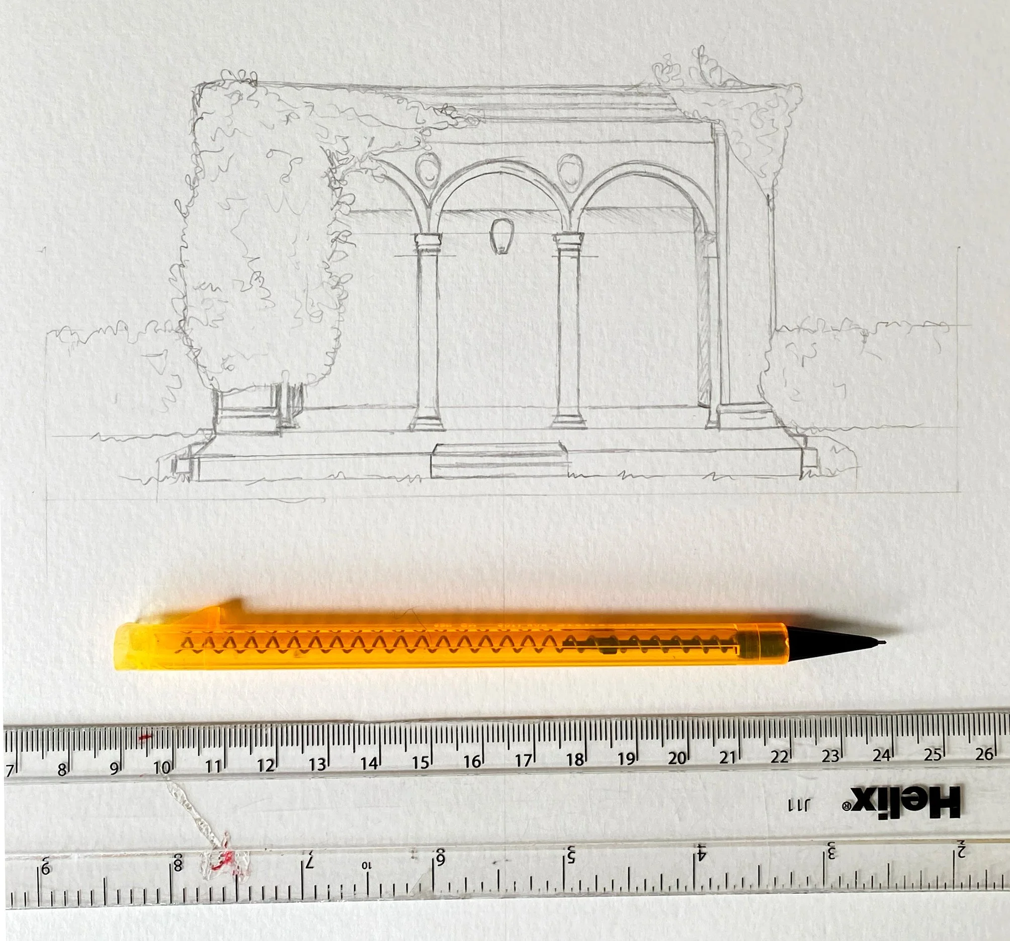
The Front: A detailed illustration of the Italian garden loggia, where the ceremony would take place.
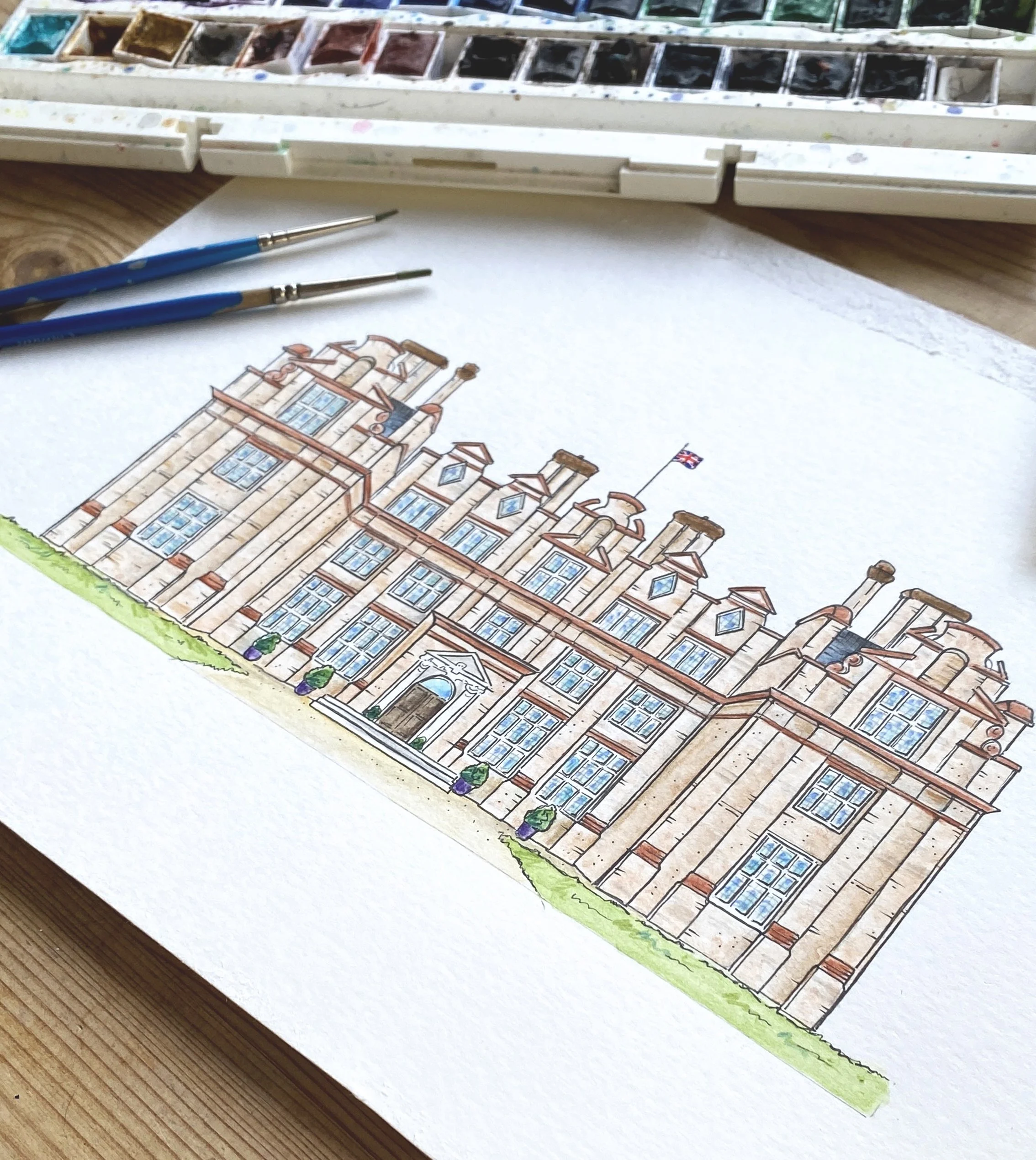
The Inside: A wide-angle illustration of the main building stretching across the bottom of the fold, framed by the estate’s greenery.
The Artistic Process
Capturing the symmetry of Broome Park required a technical approach. I began with pencil sketches to get the proportions and angles of the main house accurate. Once the scale was set, I used fine-liner pens to lock in the architectural details before moving on to color.
The illustrations were built up using light watercolor washes, followed by finer brushwork for detail. To finish, I used a mix of pen nib thicknesses to add depth and shadow, with colored pencils used to sharpen specific highlights against the softer paint.
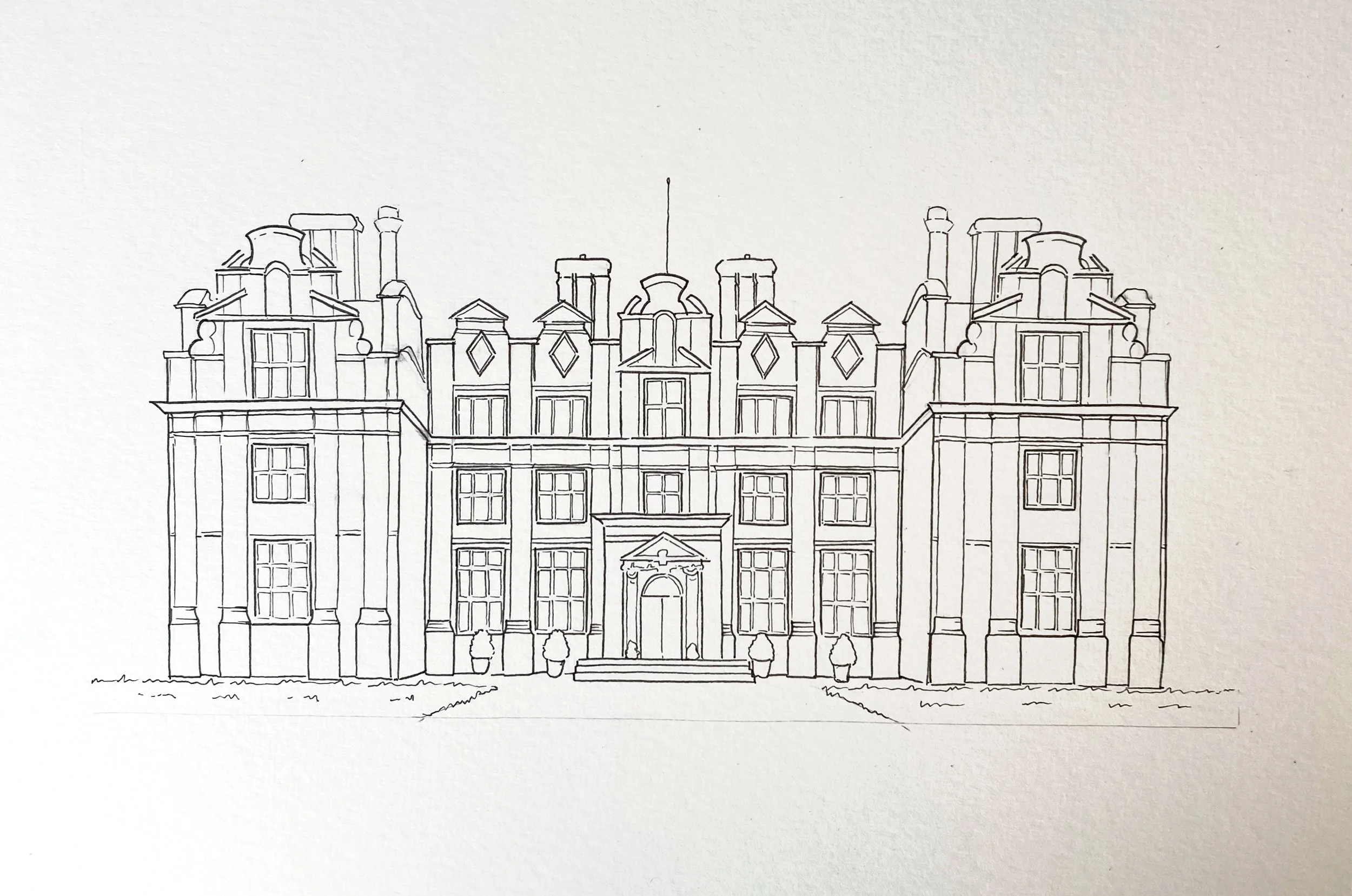
Initial outline of main building at Broome Park inked
Meaningful Details
We integrated the blue and red color scheme subtly through the florals in the landscape illustrations. The couple also requested a specific nod to one of their careers: two ribbon shapes in the top corners inspired by British Airways branding.
On the inner panels, we kept things clean with a simple icon timeline. Using a line-art style ensured the schedule was easy to read without competing with the main venue artwork.
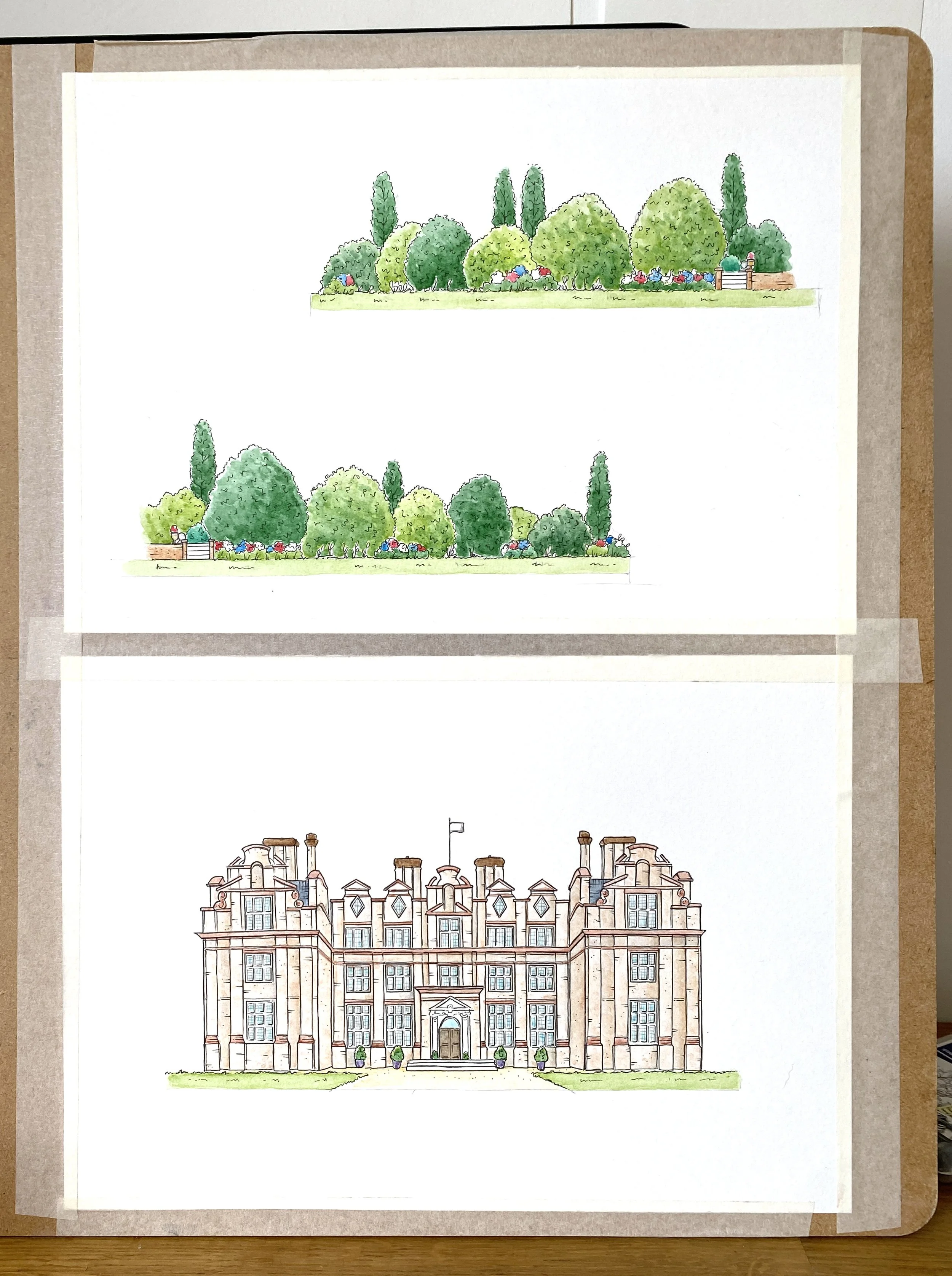
Process shot of the inner illustration, showing the main building and the illustrations of the grounds where I incorporated the red and blue flowers to match the scheme of the wedding.
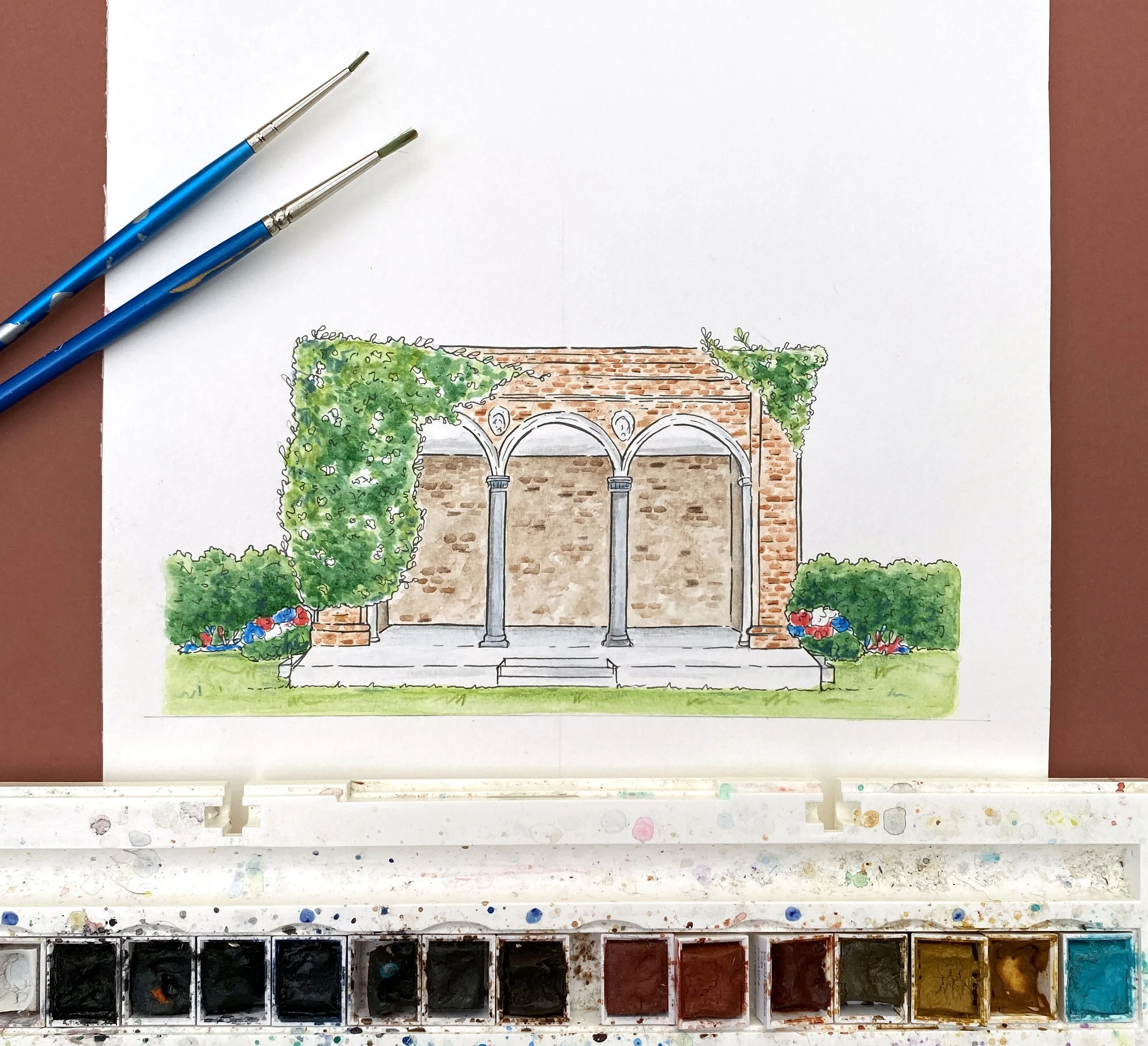
Finished watercolour illustration of the loggia in the Italian gardens at Broome Park
The Finish
The invitations were printed in a 148mm x 148mm square format on luxury cotton paper. The heavy, textured feel of the stock complemented the hand-drawn nature of the design, finished with classic white envelopes.
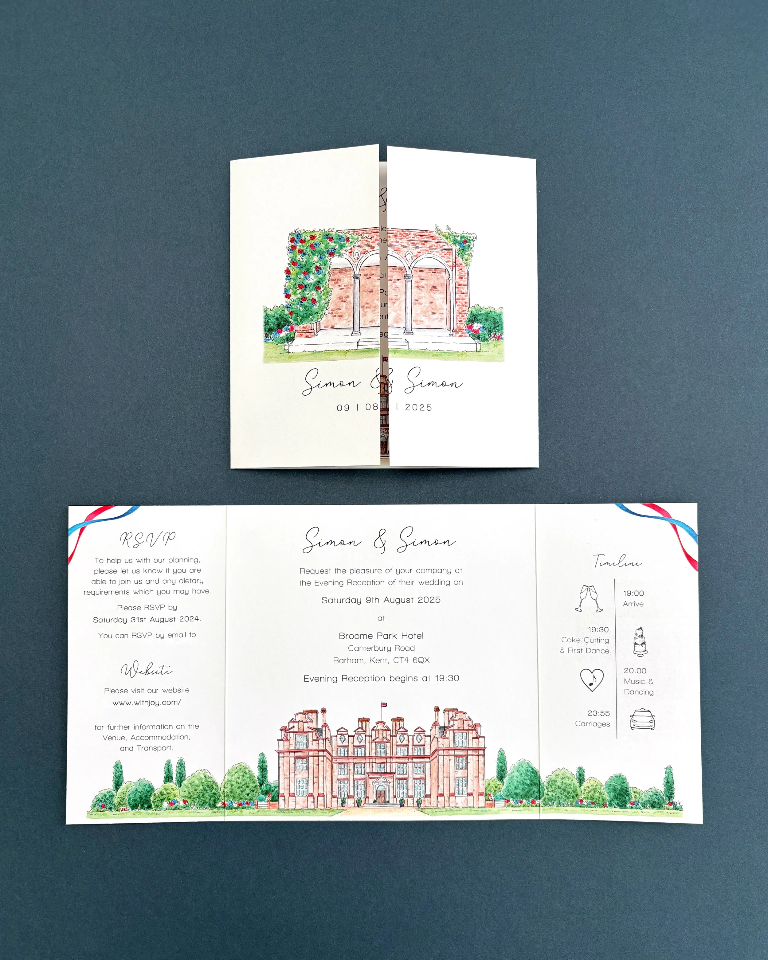
The finished gatefold wedding invitation design, printed on cotton paper.