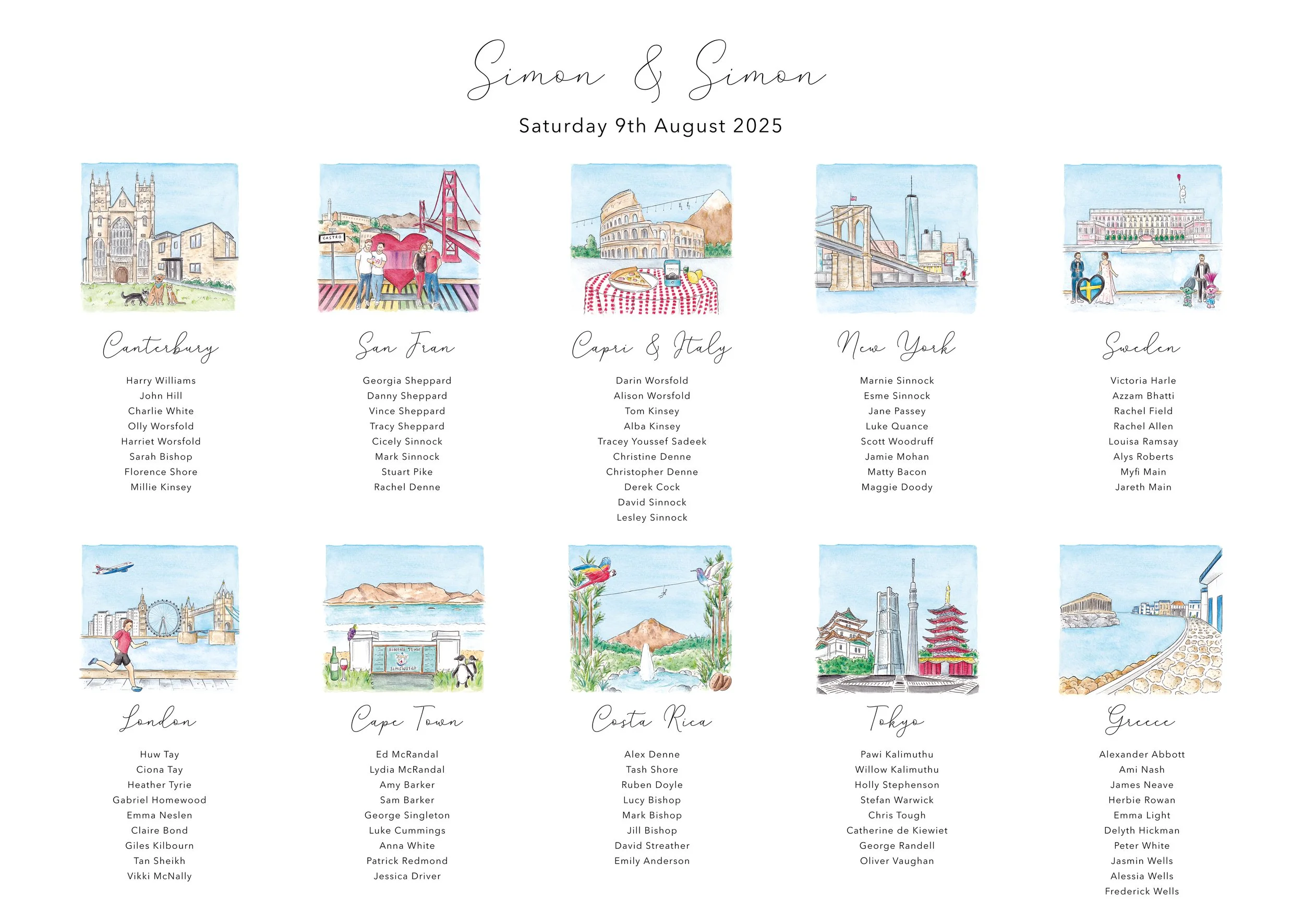

Simon & Simon: A Travel-Themed Wedding Table Plan
As a couple who loves to travel, Simon & Simon wanted their table names to feature the places that hold a special place in their hearts. What made these different from previous travel-based plans I’ve worked on were the stories they wanted to share within the illustrations—not just landmarks, but the things they did and the food they enjoyed.
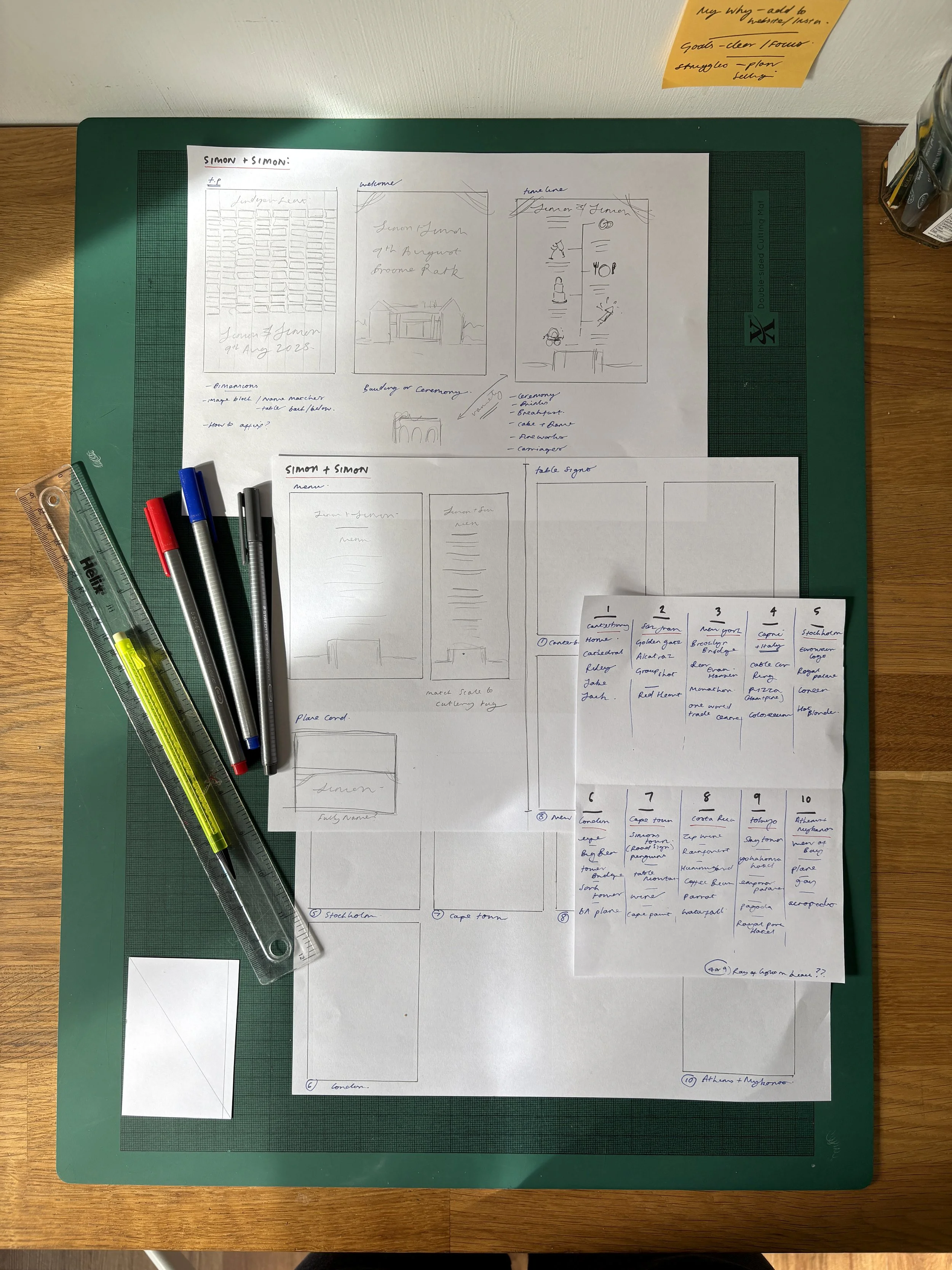
Client Meeting & Concept
When I met with the grooms, they talked me through each location and the specific memories they wanted depicted. Listening to them share these stories allowed me to see which parts truly got them excited, helping me identify the focal point for each scene.
An unusual part of the brief was that the artwork wouldn’t be displayed together as a traditional table plan on the day. Because the couple intended to frame the signs in their home after the wedding, every piece needed to work together in terms of size, scale, and color.
Planning and Research
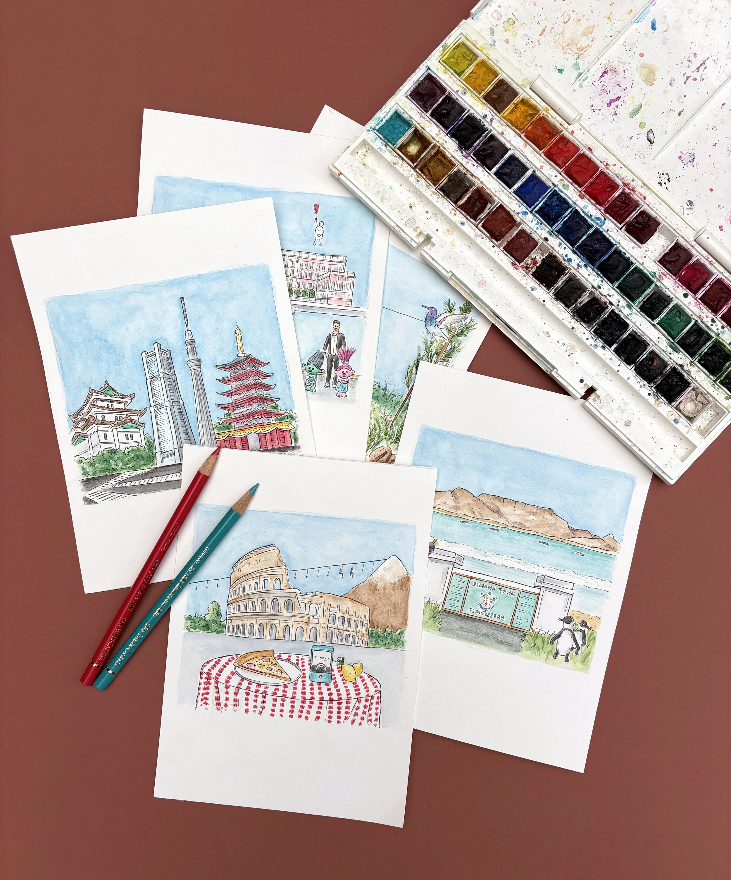
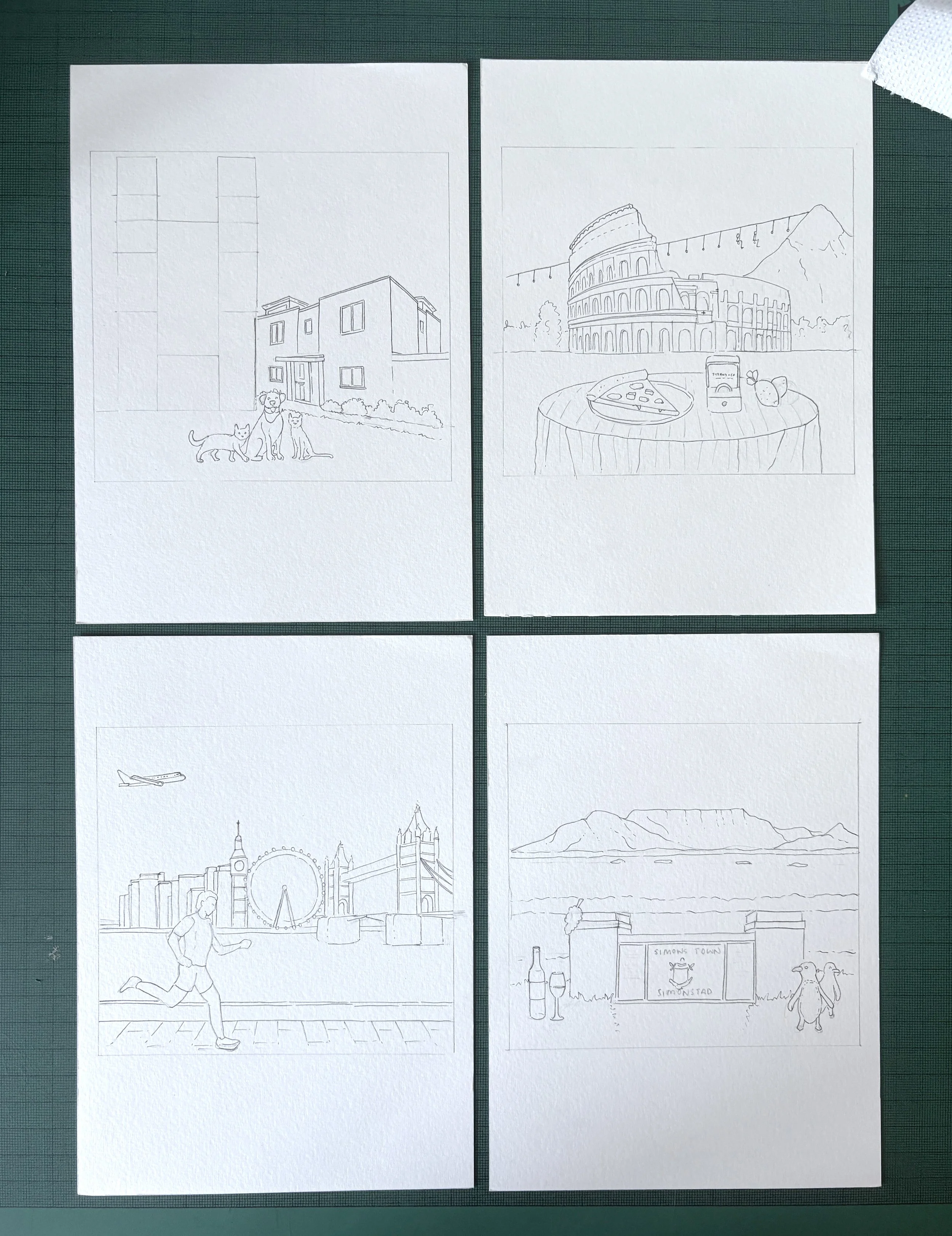
I researched ten specific locations, mocking up compositions that balanced landmarks with personal memories:
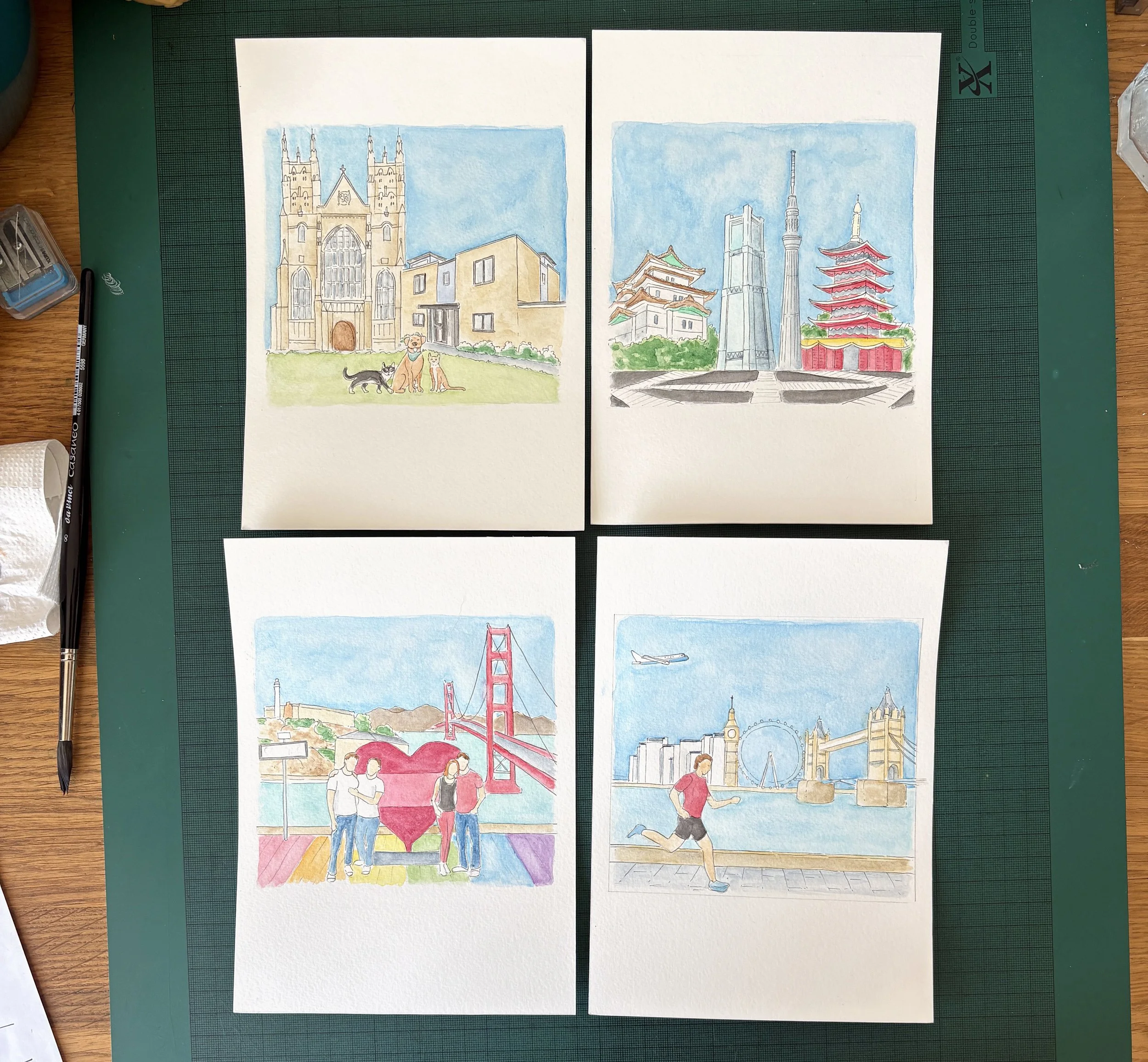
Canterbury: The Cathedral, their home, and their three pets.
San Francisco: Golden Gate Bridge, The Castro, and friends they visited.
New York: Brooklyn Bridge, Dear Evan Hansen on Broadway, and a marathon runner.
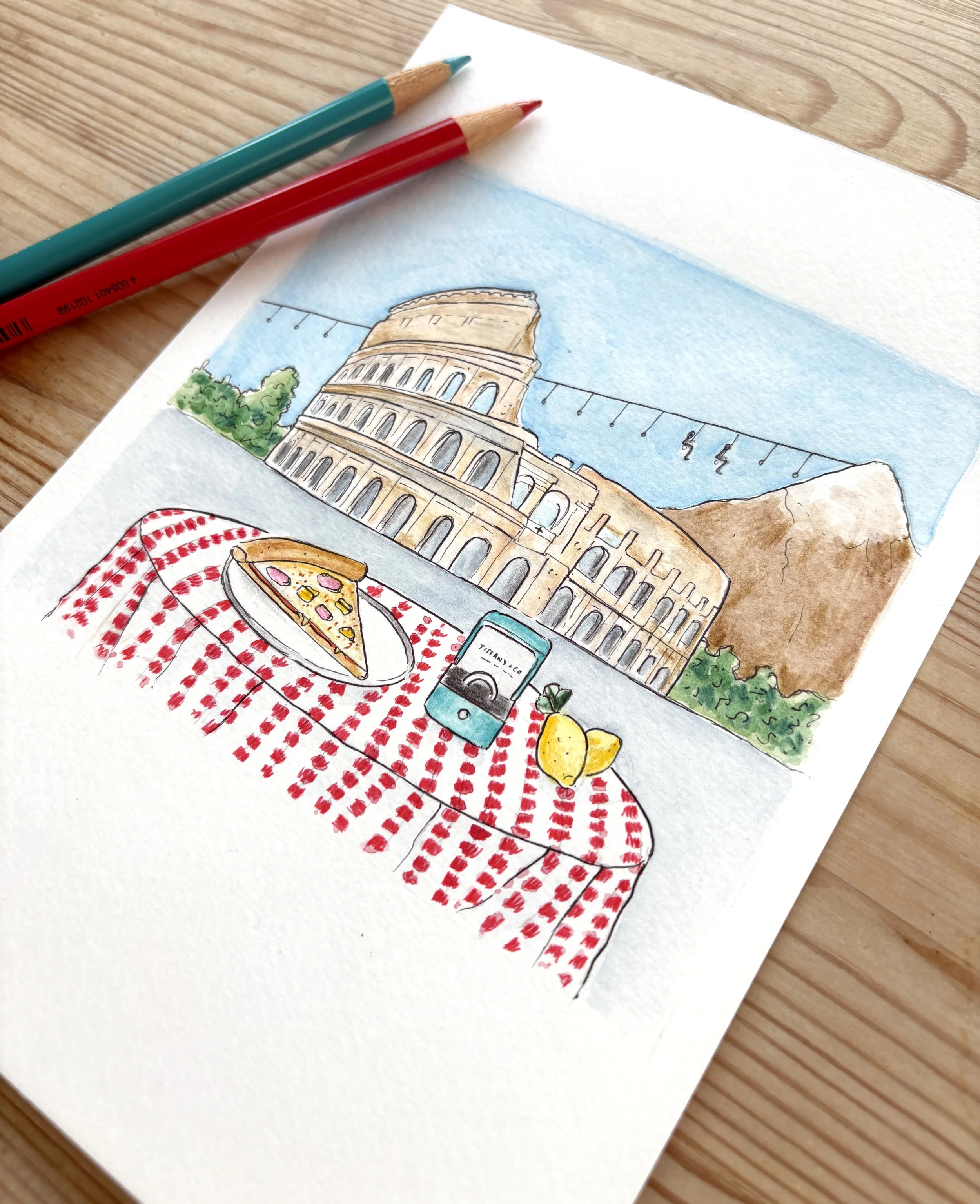
Capri & Italy: The Colosseum, mountain cable lift, and a Tiffany engagement ring.
Stockholm: Royal Palace and Eurovision nods (the presenters and previous winner).
London: London Eye, their previous apartment, and a BA plane.
Cape Town: Table Mountain, penguins, and wine.
Costa Rica: Rainforest, zip wire, waterfall, and coffee beans.
Tokyo: Sky Tower, Emperor’s Palace, and the 8-way crossing.
Athens & Mykonos: Acropolis, the bay view, and a plane.
Personal themes ran throughout the set, such as a runner to represent the cities where one groom completed marathons and a BA plane for the other’s career.
Drawing & Creative Process
Each scene was drawn on A5 paper within a uniform square to ensure the scales matched. I started with a pencil sketch, followed by an initial black outline using a 0.05 fineliner—the smallest nib I work with—to flesh out the detail before painting.
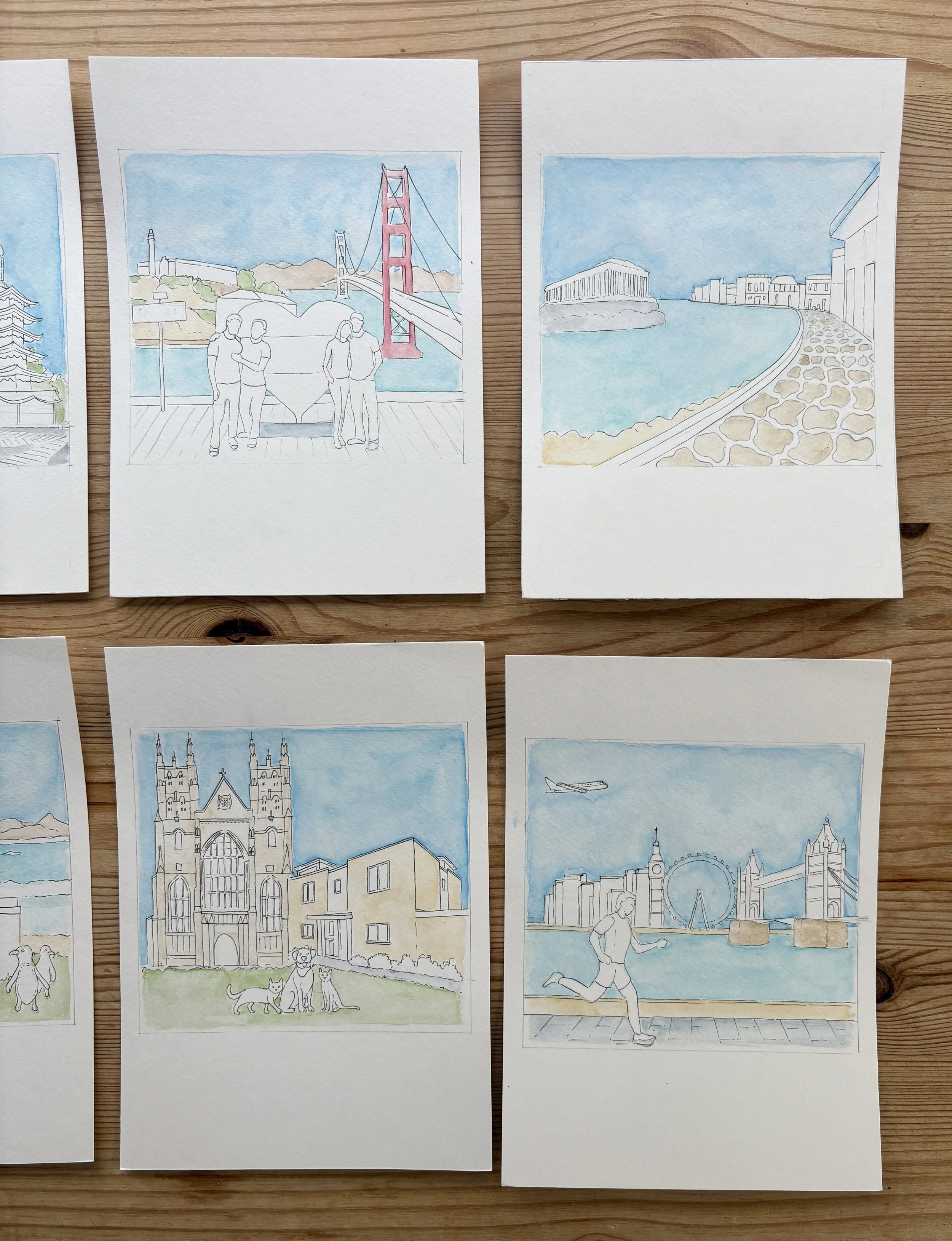
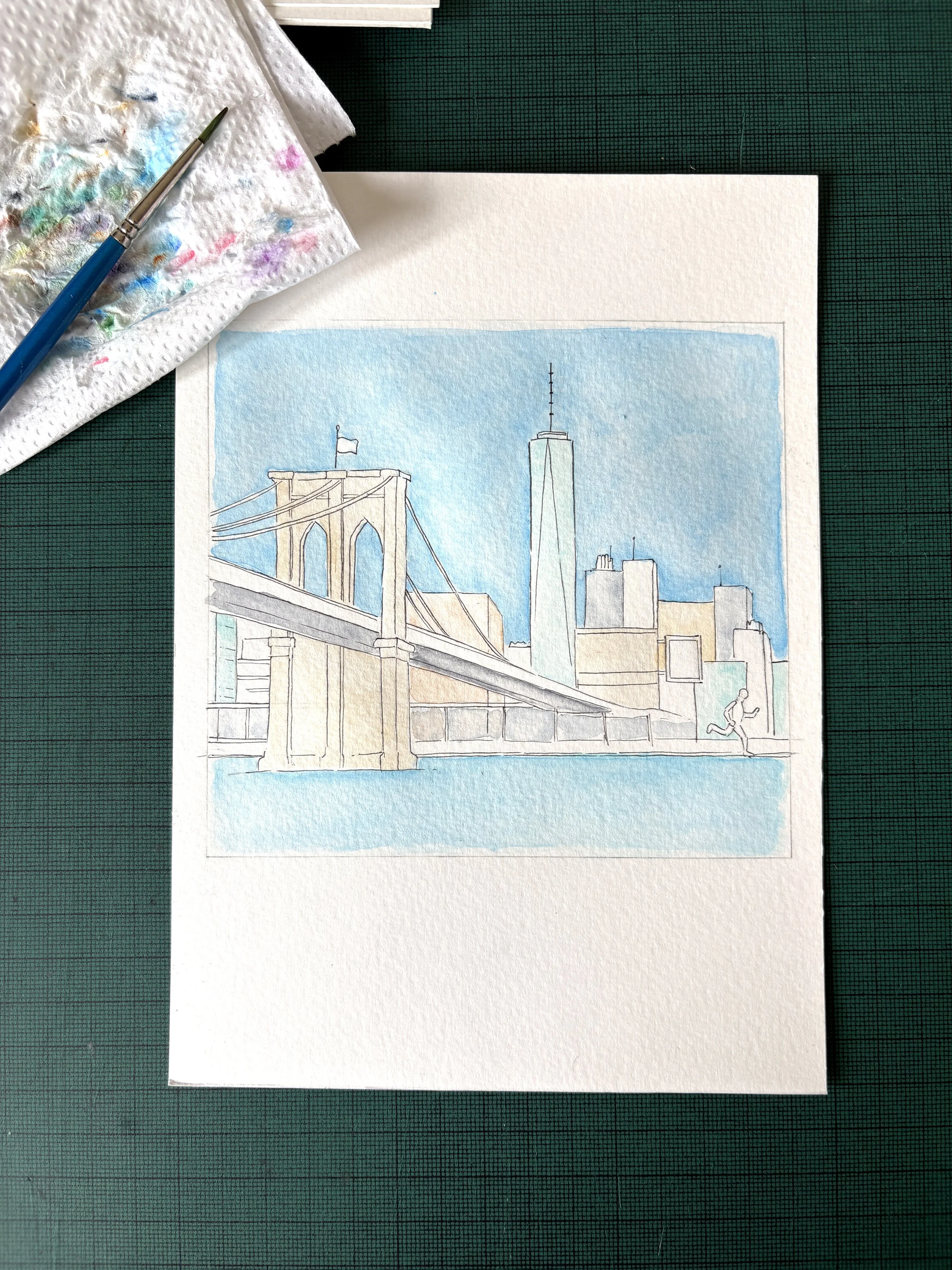
I gradually built up the tone and detail using watercolors. Once I was happy with the depth, I re-inked the outlines and picked out final details with pencils and colored pens.
One challenge I found was that the blue of the skies had noticeable differences once scanned. To fix this, I painted a separate "master" blue sky and used Photoshop to manually replace the sky in each illustration. It was a time-consuming process to remove the original backgrounds from around the fine details, but the resulting consistency was well worth it.
The Final Designs
Once the scenes were complete, I added the table names using the same font from the wedding invitations. Each was printed double-sided on soft, white, textured A5 paper stock.
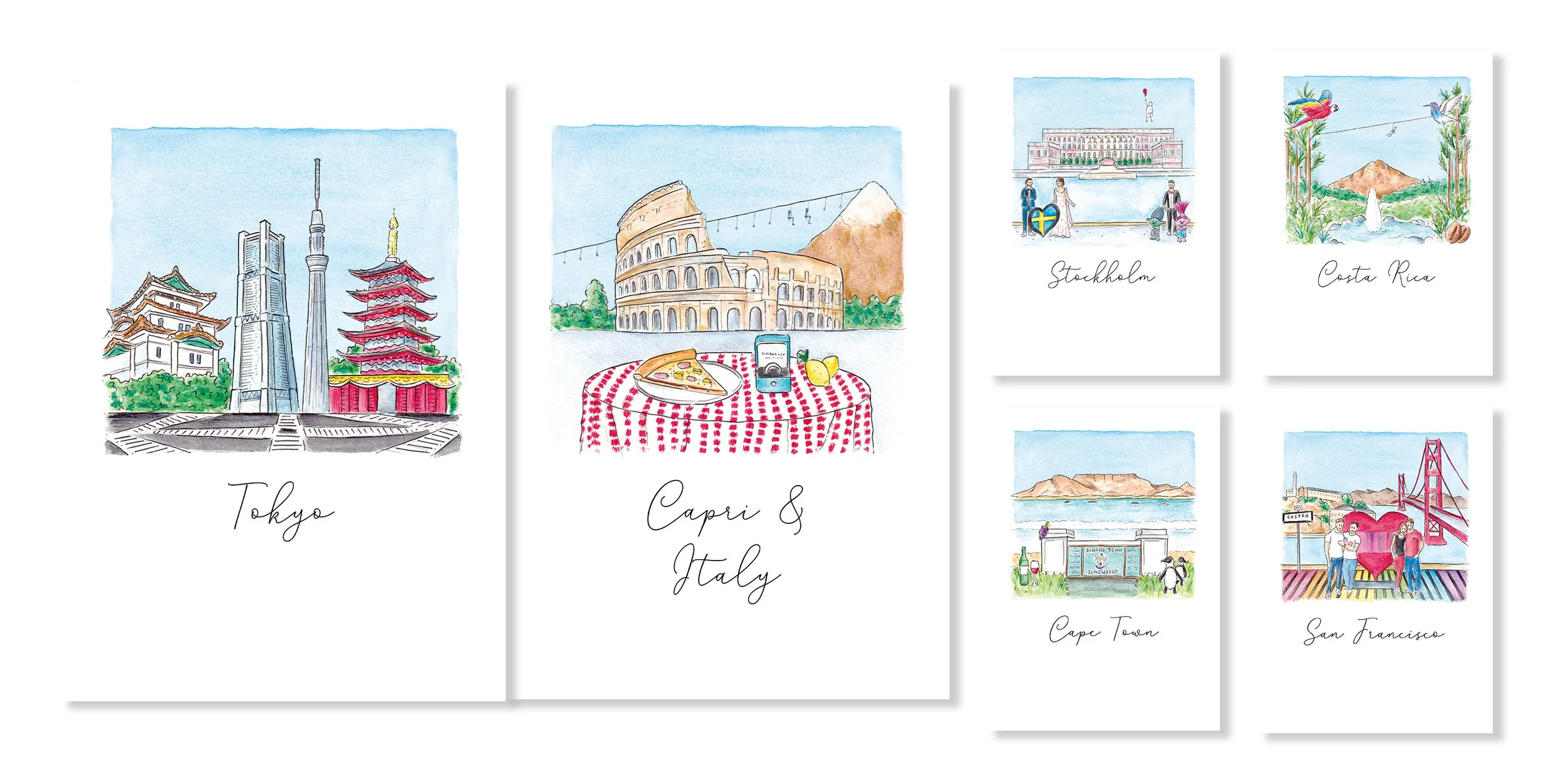
For this blog, I have created a mock-up of how the illustrations would look together if they had been used as a traditional table plan.