

A Hand-Painted Gift: Capturing Pelham House

I was recently commissioned to create a gift illustration of the beautiful Pelham House in Lewes. It was a wedding day surprise from a sister to her sister and brother-in-law—what a wonderfully thoughtful way to commemorate their day!
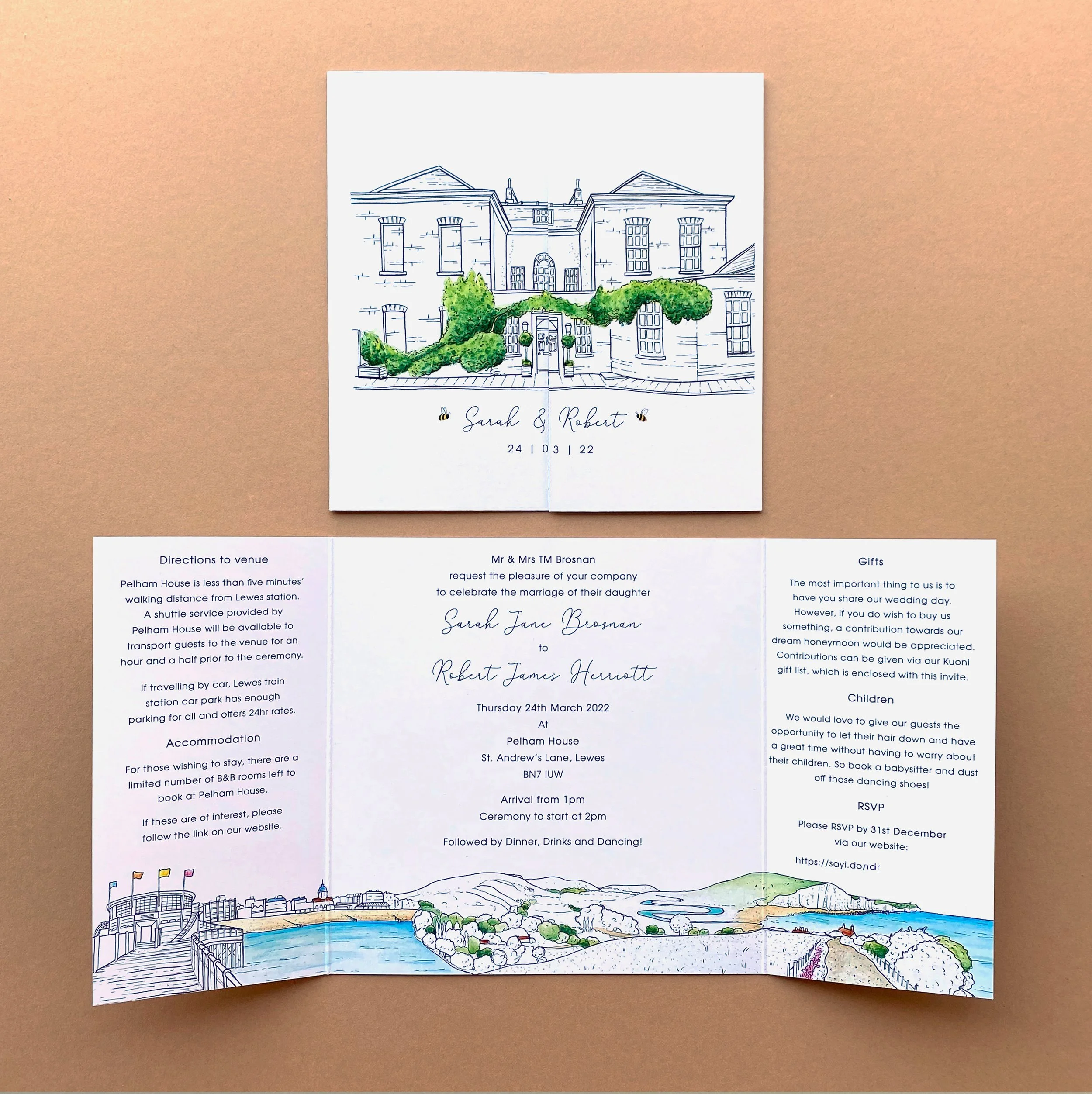
This is such a lovely venue; in fact, it’s one we even looked at when we were planning our own wedding before the pandemic and moving to Kent. It holds a special place in my memory, and I was excited to revisit it for this commission. I’d also previously illustrated Pelham House for a stationery commission—used on a save the date and invitation—so it was fun to revisit the architecture from a new perspective.

The Illustration Process: From Sketch to Watercolour
1. Research and Proportions
To begin the process, I researched the specific view of the venue that Sophie had requested. I spent time closely studying the size and shapes of all the architectural features, breaking it down into basic shapes in my sketchbook. This crucial step ensures I get the correct proportions before committing to the final paper.

2. Setting up the Canvas
For gift illustrations, I like to use Windsor & Newton watercolour paper in 12" x 9" sheets. This is slightly larger than A4 and leaves a generous border, which is perfect for framing. Once I was happy with my pencil layout—blocking out the main shapes and adding initial detail—I moved on to the inking stage.

3. Adding Fine Detail with Pen and Ink
I started inking in the detail using pen and ink, beginning with an initial thin line across the entire illustration. Pelham House has a lot of windows and intricate panes, so I had to take extra care here to ensure they looked even and accurate.

4. Building Colour with Watercolour
Having completed the precise inking, I moved on to the painting process. I always start with the sky, which forms the background to the portrait. Once I was happy with that, I began gradually building up the colour detailing of Pelham House itself.
Part of what I love about this venue is the vines and greenery growing beautifully on the front and around the door frame. This greenery is so fun to sketch and paint, as it provides a wonderful contrast, breaking up the brick tones and square shapes of the building.
As with all my paintings, I gradually built up the watercolour washes until I was happy with the tone and detail.
5. The Final Touches
I then returned to the pen and ink, applying detail over the top and going back over the initial line in a thicker nib. This added depth and left a clean, crisp outline to the building.
The final stage was using a pencil to gently pick out some of the textural details, like the bricks, and add a bit of contrast. I always aim for just enough contrast to make the painting pop without overpowering the delicate watercolour washes.
The completed illustration was finished with the date of the wedding added below the artwork—a beautiful, lasting memento for the couple to cherish their special day at this truly wonderful venue.
