
Capturing Dreamland

Watercolour and pencil illustration of Dreamland, Margate
I recently participated in a wedding fair at Dreamland in Margate. To mark my first event at this venue, I wanted to create a watercolour illustration of the unique and iconic building.
Research and Composition
My process began as ever by studying the building, looking at reference and sketching.. I considered the different views of the venue, focusing on size, scale, and angles to inform the final composition. Given Dreamland's distinctive energy as a fun and vibrant wedding location, I knew the illustration should be in full colour, specifically the iconic yellow lettering and the brown brick tones that are so recognisable.
I started the drawing by sketching the building's outline, focusing on proportions and perspective. Due to the unique profile and varying heights, I chose to draw the building at an angle over a straight-on view. This meant I spent a lot of time initially perfecting the perspective and horizon points.
Outlining and Layering Washes

Dreamland Venue Illustration - Progress shot
Once the pencil sketch was complete and I was happy with how everything was looking, I began outlining the details with a fine liner, marking out the most distinctive lines first, using a variety of thickness depending on the size and shadow is each section.
Once I had the initial outline inked in, I began the process of applying watercolour washes. My approach to this medium differs from many traditional methods, working with it similarly to how one might use acrylics or oils, employing a gradual layering technique. I always begin with reserved washes, meticulously building up tone and detail over time. Working like this allows me to create a depth and richness to my illustrations that I like.
Adding Depth and Definition
After building up the watercolour base and ensuring the colours complemented the building's tone, I returned to the inking stage. I went over the initial fine liner outlines, to add depth, shadows, and definition. I apply this technique to my building portraits because it restores a bold, crisp line where the initial ink may have softened or faded during the painting stages.
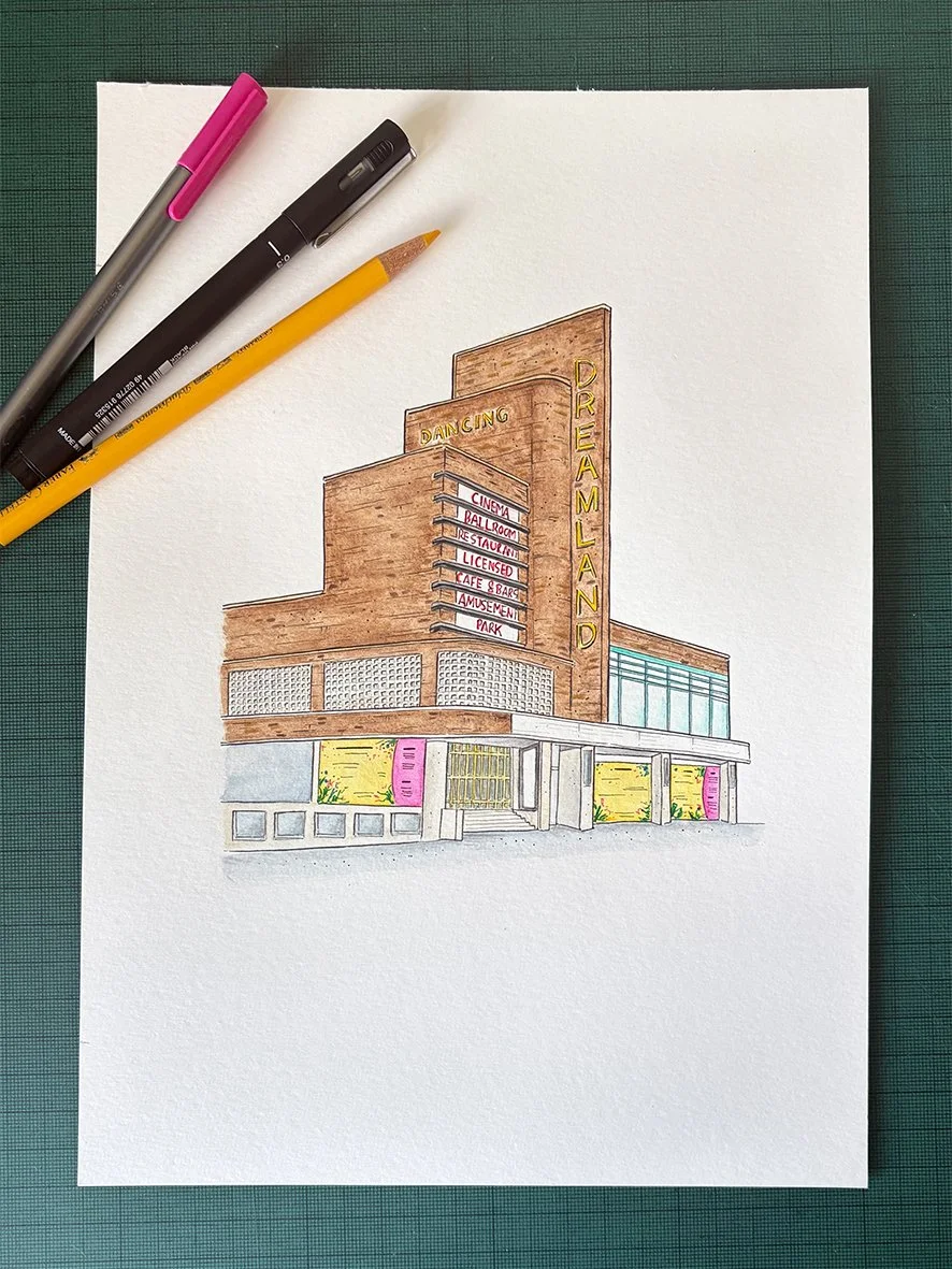
The final stage of the illustration process is to use coloured pencils to add in the final details and finishing touches. For this image, I wanted a bright, vibrant result, and the pencils provide a sharp contrast next to the softer watercolour tones, allowing the final details to "pop."
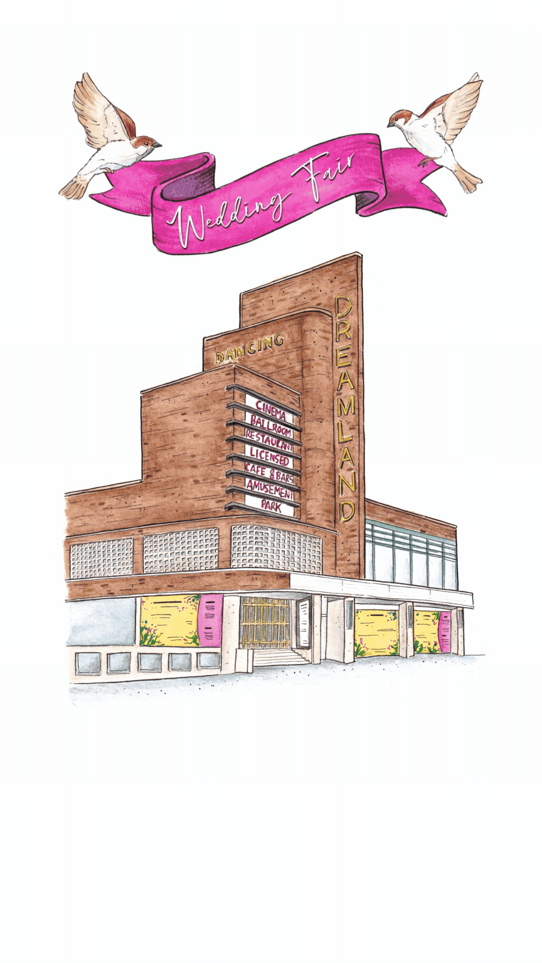
As this illustration was inspired by a wedding fair I wanted to use it as part of a graphic to promote the event. I scanned the final image in and created a digital flyer using Adobe Express. I experimented by integrating a simple animation using some pre-existing bird sketches to give it a playful feel and add extra depth to the design.